Go Transit, 2025
A GO Transit app that limits stress and confusion of riders by providing an enhanced user experience.
SCOPE
UI/UX Design
TOOLS USED
Figma
Adobe Illustrator
TEAM
Mya Reboredo
Kezia Eberlin
Mekhi Blair
Drake Hendrickson
THE PROBLEM
The current GO Transit system presents several challenges for riders, such as the lack of real-time updates, the need to rely on multiple different apps for trip planning, and difficulty locating nearby lines and stations.
THE RESEARCH
We interviewed 5 people ages 18 - 28 who regularly use the GO transit system, in order to understand the challenges and needs of users. For more insights, we analyzed online reviews as well.
THE PROCESS
After our interviews, we developed our first prototype. Then, tested it with our 5 interviewees.
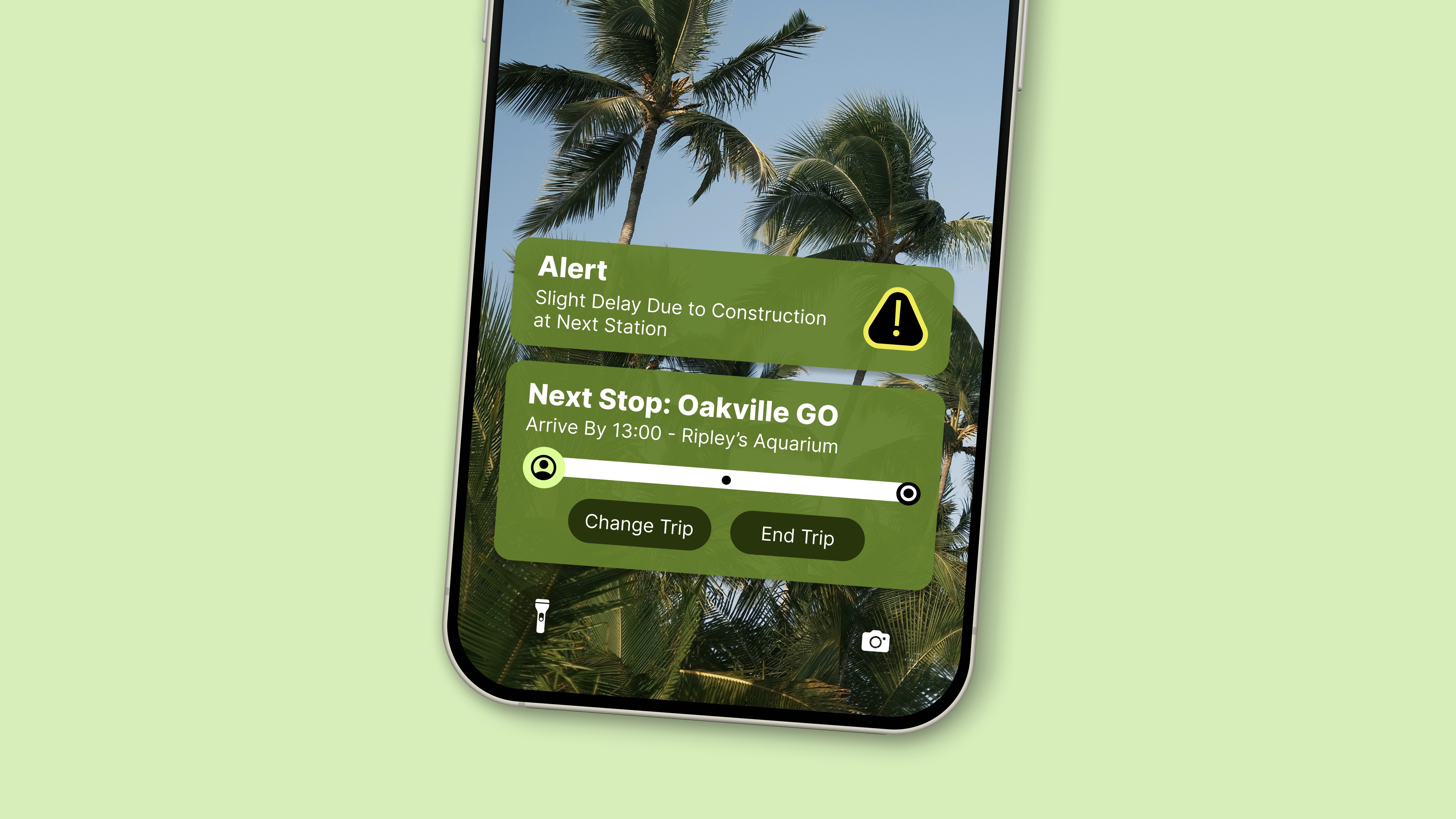
THE SOLUTION
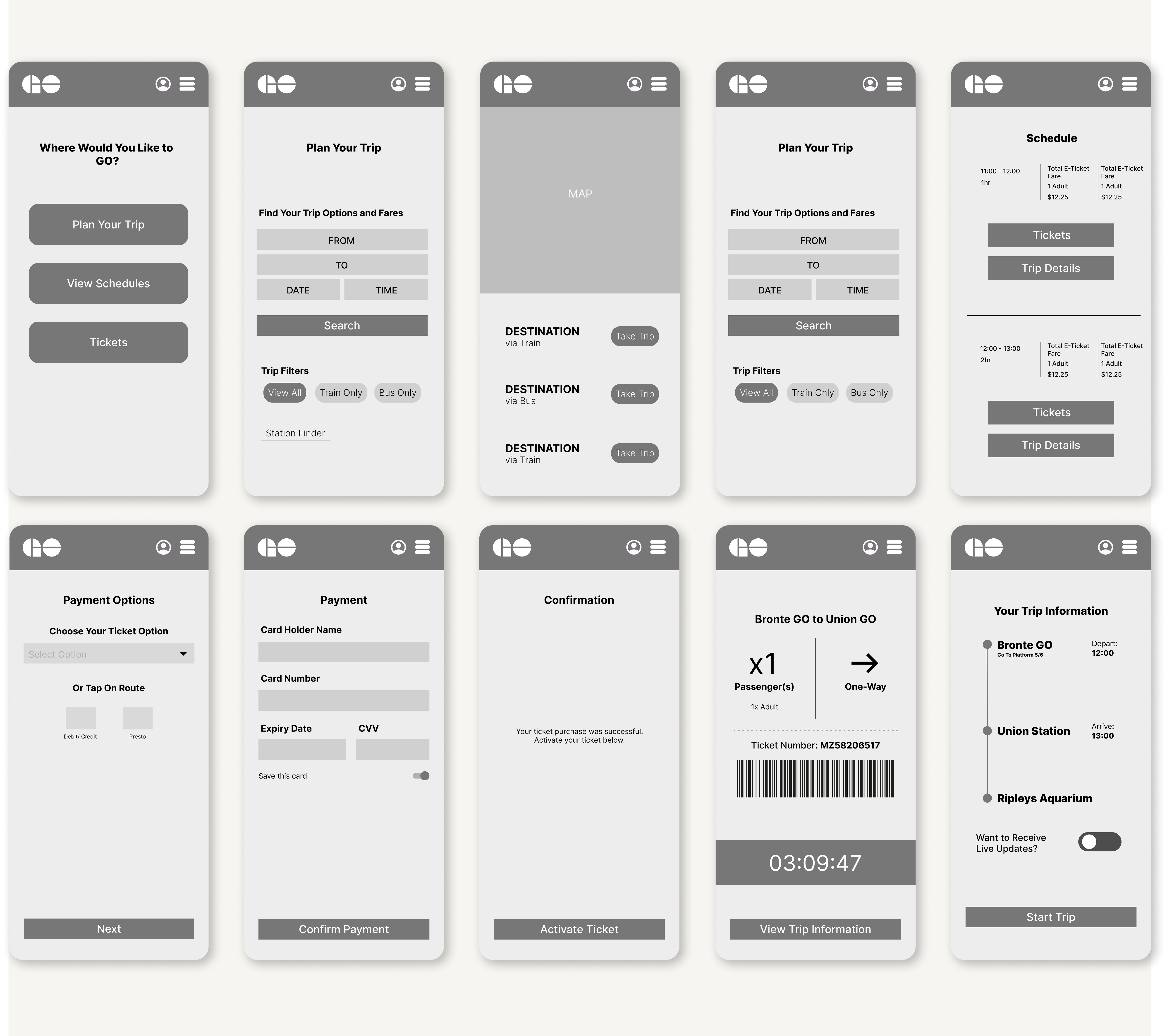
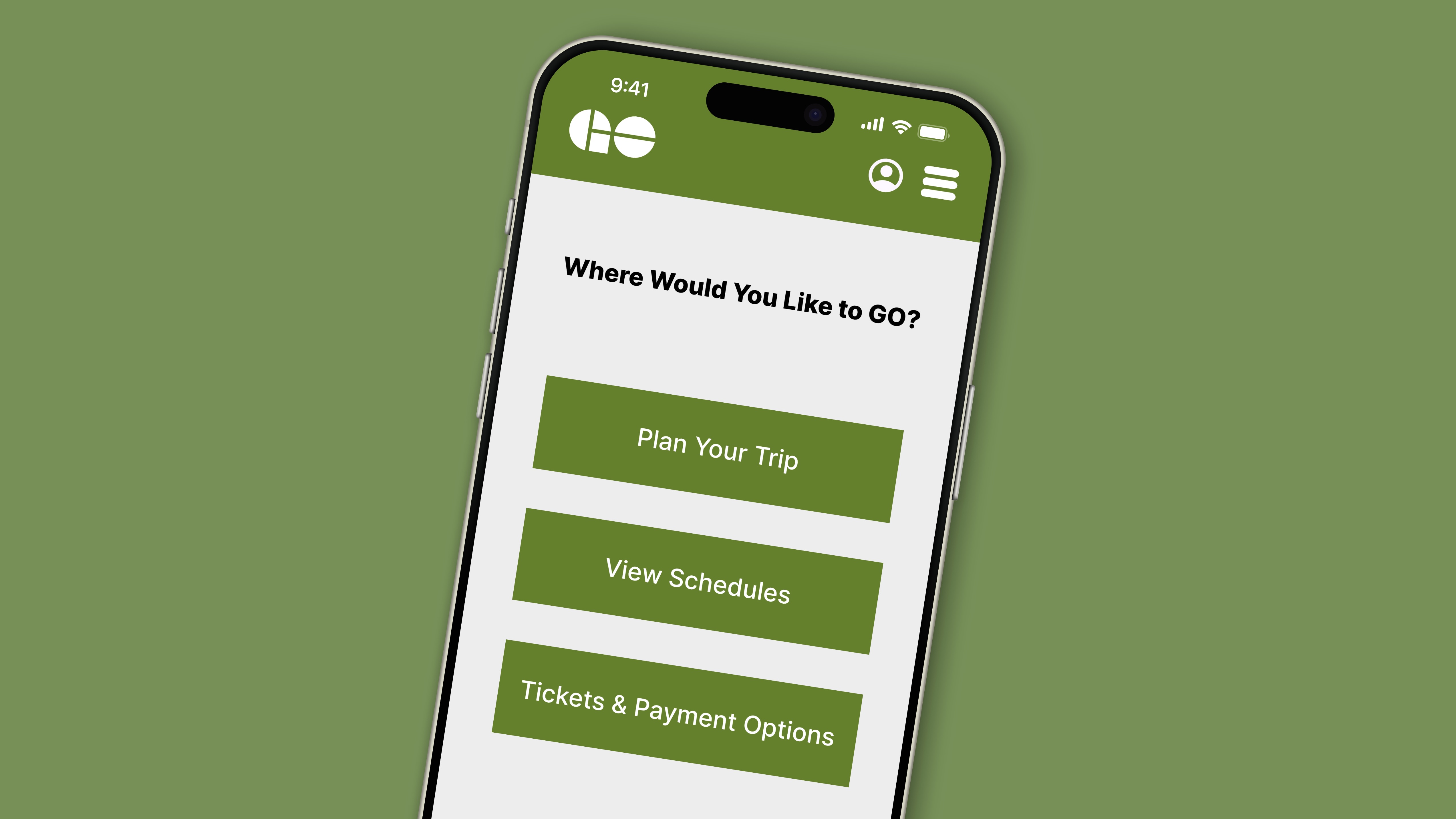
To begin, we added simplified content to the main screen, to prioritize key actions.
Then, we added a 'Station Finder' button, to eliminate the extra step of manually searching for the nearest GO station to your destination.
We also added in in-app activation, eliminating the use of other apps.
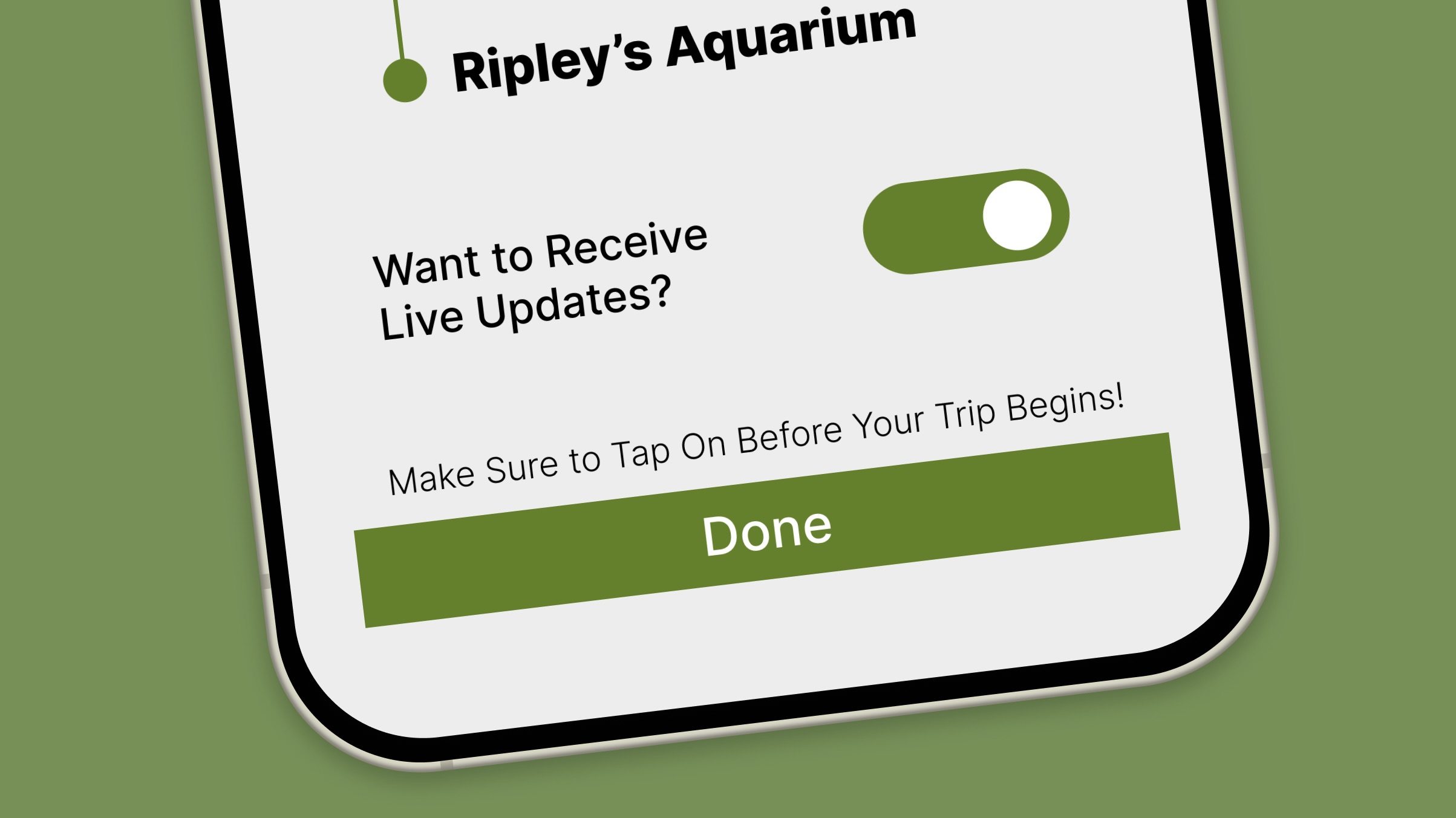
Once activated, you're able to view your trip information, including platform number.
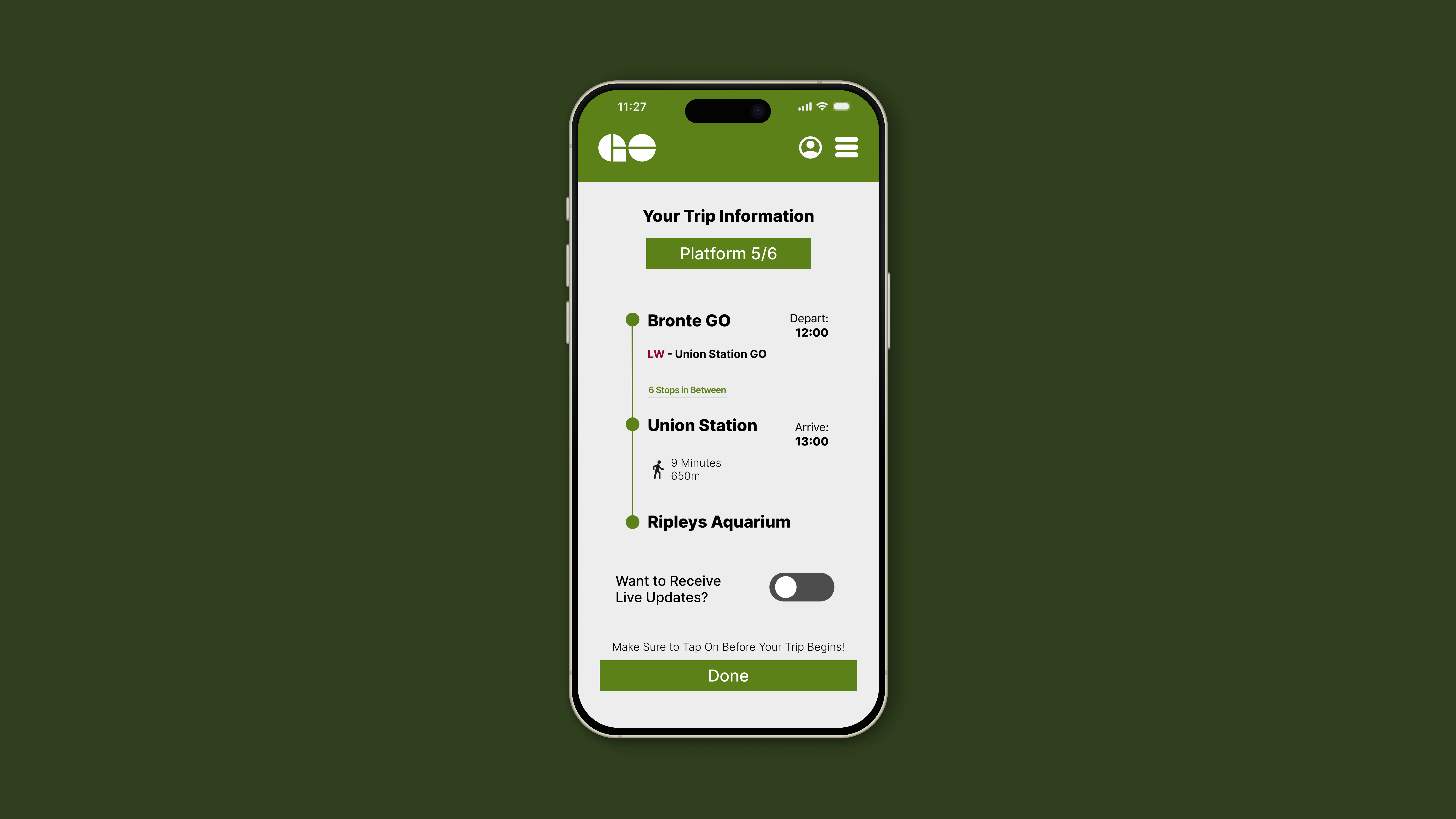
Finally, you're able to receive live updates and track your location along your route.
EXPLORE MORE OF MY WORK